Redesigning a
Financial Product Experience
Redesigning a
Financial Product Experience
Role
Role
Product Designer
Product Designer
Client
Client
Global financial institution
Global financial institution
Platform
Platform
Mobile app
Timeline
10 weeks
10 weeks
OVERVIEW
OVERVIEW
Finovo combines real-time market updates, expert research, financial news, & curated insights in one app.
Finovo combines real-time market updates, expert research, financial news, & curated insights in one app.
When I joined, the product was an early-stage prototype. As the Product Designer, I redesigned key flows, refreshed the UI, and built a scalable design system to support content-heavy financial experiences across iOS and Android.
When I joined, the product was an early-stage prototype. As the Product Designer, I redesigned key flows, refreshed the UI, and built a scalable design system to support content-heavy financial experiences across iOS and Android.
When I joined, the product was an early-stage prototype. As the Product Designer, I redesigned key flows, refreshed the UI, and built a scalable design system to support content-heavy financial experiences across iOS and Android.
This project was completed under a confidentiality agreement. Visuals, data, and references have been anonymized.
This project was completed under a confidentiality agreement. Visuals, data, and references have been anonymized.
THE CHALLENGE
THE CHALLENGE

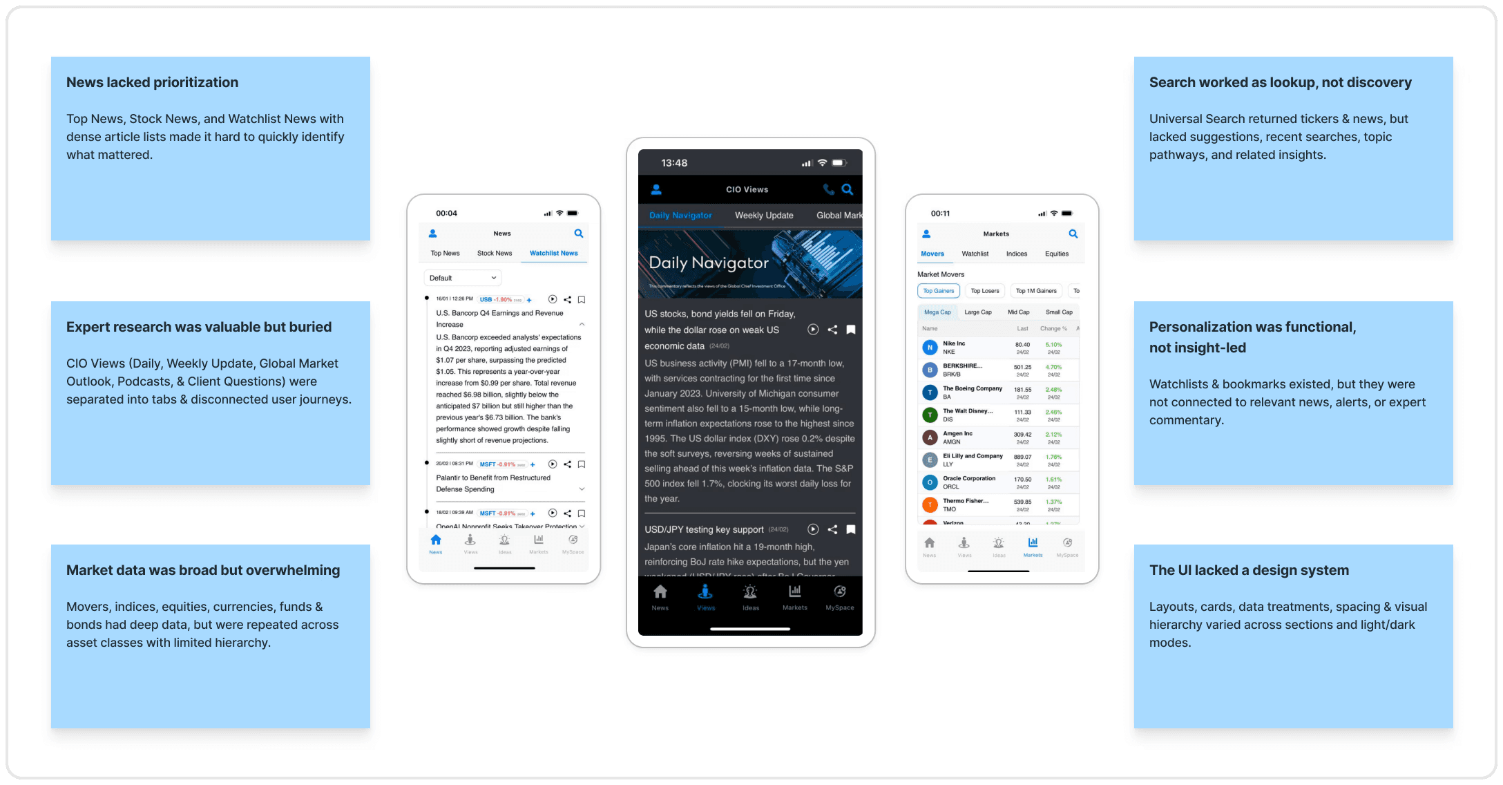
Finovo had strong financial content, but the prototype did not support how users naturally researched, monitored, and consumed market information.
The issue was not the content itself, but how it was structured, surfaced, and experienced. Dense screens made information difficult to scan, relevant insights were hard to find, and fragmented navigation created confusion across key journeys.
Finovo had strong financial content, but the prototype did not support how users naturally researched, monitored, and consumed market information.
The issue was not the content itself, but how it was structured, surfaced, and experienced. Dense screens made information difficult to scan, relevant insights were hard to find, and fragmented navigation created confusion across key journeys.
Finovo had strong financial content, but the prototype did not support how users naturally researched, monitored, and consumed market information.
The issue was not the content itself, but how it was structured, surfaced, and experienced. Dense screens made information difficult to scan, relevant insights were hard to find, and fragmented navigation created confusion across key journeys.
How might we help users make sense of complex financial information with greater clarity, confidence, and trust?
How might we help users make sense of complex financial information with greater clarity, confidence, and trust?
KEY PROBLEMS IDENTIFIED
KEY PROBLEMS IDENTIFIED
Users struggled to quickly understand what mattered, leading to overwhelm and disengagement.
Content overload
Users struggled to quickly understand what mattered, leading to overwhelm and disengagement.
Content overload
Users struggled to quickly understand what mattered, leading to overwhelm and disengagement.
Content overload
Users had difficulty finding relevant information, reducing the perceived value of the product.
Weak content discovery
Users had difficulty finding relevant information, reducing the perceived value of the product.
Weak content discovery
Users had difficulty finding relevant information, reducing the perceived value of the product.
Weak content discovery
Users had to jump between sections to complete related tasks, increasing friction and drop-off.
Navigation & Intent mismatch
Users had to jump between sections to complete related tasks, increasing friction and drop-off.
Navigation & Intent mismatch
Users had to jump between sections to complete related tasks, increasing friction and drop-off.
Navigation & Intent mismatch
The experience felt less credible & would become harder to scale across new flows, widgets, & content.
No scalable design system
The experience felt less credible & would become harder to scale across new flows, widgets, & content.
No scalable design system
The experience felt less credible & would become harder to scale across new flows, widgets, & content.
No scalable design system
DESIGN GOALS
DESIGN GOALS
The goal was to evolve the prototype into a more usable, credible, and scalable financial intelligence product.
The goal was to evolve the prototype into a more usable, credible, and scalable financial intelligence product.
The goal was to evolve the prototype into a more usable, credible, and scalable financial intelligence product.
(01)
Clearer product journeys
Restructure the IA and key flows around how users actually interact with financial news & markets.
(01)
Clearer product journeys
Restructure the IA and key flows around how users actually interact with financial news & markets.
(02)
Reduce cognitive load
Make dense financial content easier to scan & understand with clearer content patterns.
(02)
Reduce cognitive load
Make dense financial content easier to scan & understand with clearer content patterns.
(03)
Build trust through design
A consistent visual language and reusable UI components, data treatments, cards, and content layouts.
(03)
Build trust through design
A consistent visual language and reusable UI components, data treatments, cards, and content layouts.
TARGET AUDIENCE
TARGET AUDIENCE
Finovo served a broad range of financially aware users, from casual market followers to advanced researchers. To guide product and design decisions, we mapped the audience into four primary user types.
Finovo served a broad range of financially aware users, from casual market followers to advanced researchers. To guide product and design decisions, we mapped the audience into four primary user types.
Finovo served a broad range of financially aware users, from casual market followers to advanced researchers. To guide product and design decisions, we mapped the audience into four primary user types.


RESEARCH & DISCOVERY
RESEARCH & DISCOVERY
Understanding the Gaps
& Oppurtunities
Understanding the Gaps
& Oppurtunities
To understand why the prototype was not resonating with the users, we conducted product evaluation, user research, market analysis & journey mapping.
To understand why the prototype was not resonating with the users, we conducted product evaluation, user research, market analysis & journey mapping.
Product & UX Audit
Product & UX Audit

Market Analysis & Analytics Review
Market Analysis & Analytics Review

Competitive Analysis
Competitive Analysis

User Interviews & Surveys
User Interviews & Surveys

Empathy Mapping
Empathy Mapping

Customer Journey Mapping
Customer Journey Mapping
DESIGN APPROACH
DESIGN APPROACH
Design for Cognitive Comfort
Financial information is inherently complex. The interface needed to reduce cognitive effort without oversimplifying the content.
Design for Cognitive Comfort
Financial information is inherently complex. The interface needed to reduce cognitive effort without oversimplifying the content.
Design for Cognitive Comfort
Financial information is inherently complex. The interface needed to reduce cognitive effort without oversimplifying the content.
INFORMATION ARCHITECTURE
INFORMATION ARCHITECTURE
Finovo's five clear destinations
The new information architecture bifurcated Home, Views, Ideas, Markets & MySpace reducing navigation clutter, groups related features more logically.
Finovo's five clear destinations
The new information architecture bifurcated Home, Views, Ideas, Markets & MySpace reducing navigation clutter, groups related features more logically.
Finovo's five clear destinations
The new information architecture bifurcated Home, Views, Ideas, Markets & MySpace reducing navigation clutter, groups related features more logically.
PROPOSED INFORMATION ARCHITECTURE
PROPOSED INFORMATION ARCHITECTURE


DESIGN SYSTEM
DESIGN SYSTEM


UI DESIGNS
UI DESIGNS
Clear first, detailed when needed.
Instead of showing every data point upfront, the new interface uses segmented tabs, card-based layouts, reusable drawers, structured detail pages support to help users move from quick scanning into deeper analysis.
Instead of showing every data point upfront, the new interface uses segmented tabs, card-based layouts, reusable drawers, structured detail pages support to help users move from quick scanning into deeper analysis.

Homepage
Daily briefing experience

CIO Views
Expert research and commentary hub

CIO Ideas
Mobile-first investment idea evaluation

Markets
Market monitoring and instrument research
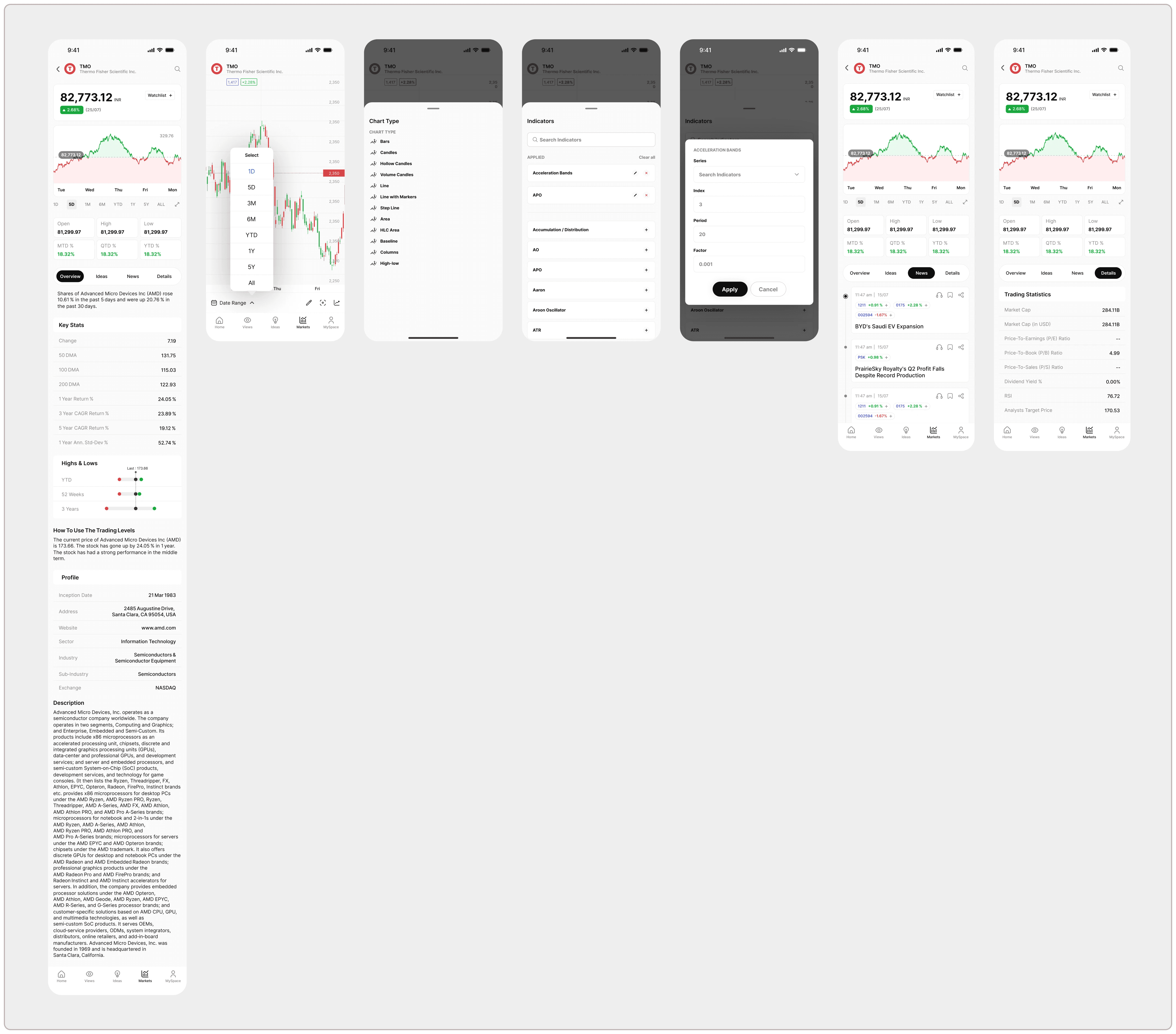
Stock Details
Charts & Expanded Tools

MySpace
Personal content, watchlists, and settings

Onboarding
Login & Sign Up
Search & Discovery
Expert research and commentary hub
Homepage
Daily briefing experience
CIO Views
Expert research and commentary hub
CIO Ideas
Mobile-first investment idea evaluation
Markets
Market monitoring and instrument research
Stock Details
Charts & Expanded Tools
MySpace
Personal content, watchlists, and settings
Onboarding
Login & Sign Up
Search & Discovery
Expert research and commentary hub
THEMES & MODES
THEMES & MODES
Designing a flexible visual system for light and dark modes.
Dark mode was designed as a complete theme system.
I adjusted surfaces, contrast, data colors, chart treatments, and navigation states to keep financial content readable, credible, and easy to scan across the app.
Designing a flexible visual system for light and dark modes.
Dark mode was designed as a complete theme system.
I adjusted surfaces, contrast, data colors, chart treatments, and navigation states to keep financial content readable, credible, and easy to scan across the app.


TESTING & ITERATIONS
TESTING & ITERATIONS
The design was validated through feedback loops with users and stakeholders.
Implementation of alternative brand font & colours
Testing focused on navigation clarity, content comprehension, search behavior, and perceived trust.
The design was validated through feedback loops with users and stakeholders.
Implementation of alternative brand font & colours
Testing focused on navigation clarity, content comprehension, search behavior, and perceived trust.


IMPACT & LEARNINGS
IMPACT & LEARNINGS
My contribution sat at the intersection of UX strategy, UI craft, and systems thinking.
I helped translate a dense financial prototype into a more guided product experience by improving navigation, discovery, content hierarchy, and reusable interface patterns.
My contribution sat at the intersection of UX strategy, UI craft, and systems thinking.
I helped translate a dense financial prototype into a more guided product experience by improving navigation, discovery, content hierarchy, and reusable interface patterns.
Testing & showcasing concepts at the Hong Kong FinTech Week.
Testing & showcasing concepts at the Hong Kong FinTech Week.

Finovo challenged me to design for a space where information density, user confidence, and credibility are deeply connected.
One of the biggest learnings was that a design system is most effective when it grows out of real product problems. In Finovo, the system was not just about visual consistency. It helped solve issues around content overload, trust, scalability, and user orientation. If I had more time, I would further explore: - Personalized onboarding based on investor type - AI-assisted summaries and market briefings - A more detailed content strategy for different user expertise levels
Finovo challenged me to design for a space where information density, user confidence, and credibility are deeply connected.
One of the biggest learnings was that a design system is most effective when it grows out of real product problems. In Finovo, the system was not just about visual consistency. It helped solve issues around content overload, trust, scalability, and user orientation. If I had more time, I would further explore: - Personalized onboarding based on investor type - AI-assisted summaries and market briefings - A more detailed content strategy for different user expertise levels